import numpy as np
import pandas as pd
import matplotlib.pyplot as plt
import seaborn as sns
import warnings

warnings.filterwarnings('ignore')

train = pd.read_csv('_data/train.csv')
test = pd.read_csv('_data/test.csv')titanic
machine learning

Data 이해
train.describe()| PassengerId | Survived | Pclass | Age | SibSp | Parch | Fare | |
|---|---|---|---|---|---|---|---|
| count | 891.000000 | 891.000000 | 891.000000 | 714.000000 | 891.000000 | 891.000000 | 891.000000 |
| mean | 446.000000 | 0.383838 | 2.308642 | 29.699118 | 0.523008 | 0.381594 | 32.204208 |
| std | 257.353842 | 0.486592 | 0.836071 | 14.526497 | 1.102743 | 0.806057 | 49.693429 |
| min | 1.000000 | 0.000000 | 1.000000 | 0.420000 | 0.000000 | 0.000000 | 0.000000 |
| 25% | 223.500000 | 0.000000 | 2.000000 | 20.125000 | 0.000000 | 0.000000 | 7.910400 |
| 50% | 446.000000 | 0.000000 | 3.000000 | 28.000000 | 0.000000 | 0.000000 | 14.454200 |
| 75% | 668.500000 | 1.000000 | 3.000000 | 38.000000 | 1.000000 | 0.000000 | 31.000000 |
| max | 891.000000 | 1.000000 | 3.000000 | 80.000000 | 8.000000 | 6.000000 | 512.329200 |
- Age 결측치 177개
test.describe()| PassengerId | Pclass | Age | SibSp | Parch | Fare | |
|---|---|---|---|---|---|---|
| count | 418.000000 | 418.000000 | 332.000000 | 418.000000 | 418.000000 | 417.000000 |
| mean | 1100.500000 | 2.265550 | 30.272590 | 0.447368 | 0.392344 | 35.627188 |
| std | 120.810458 | 0.841838 | 14.181209 | 0.896760 | 0.981429 | 55.907576 |
| min | 892.000000 | 1.000000 | 0.170000 | 0.000000 | 0.000000 | 0.000000 |
| 25% | 996.250000 | 1.000000 | 21.000000 | 0.000000 | 0.000000 | 7.895800 |
| 50% | 1100.500000 | 3.000000 | 27.000000 | 0.000000 | 0.000000 | 14.454200 |
| 75% | 1204.750000 | 3.000000 | 39.000000 | 1.000000 | 0.000000 | 31.500000 |
| max | 1309.000000 | 3.000000 | 76.000000 | 8.000000 | 9.000000 | 512.329200 |
- Age 결측치 86개
- Fare 결측치 1개: 이 정도는 그냥 삭제해도 될듯
plt.figure(figsize=(15, 10))

# Age 분포 확인
plt.subplot(2, 2, 1)
sns.boxplot(x='Survived', y='Age', data=train)
plt.title('Age 분포 (생존 여부별)')

# Fare 분포 확인
plt.subplot(2, 2, 2)
sns.boxplot(x='Survived', y='Fare', data=train)
plt.title('Fare 분포 (생존 여부별)')

# Pclass에 따른 Age 분포
plt.subplot(2, 2, 3)
sns.boxplot(x='Pclass', y='Age', data=train)
plt.title('Age 분포 (객실 등급별)')

# Pclass에 따른 Fare 분포
plt.subplot(2, 2, 4)
sns.boxplot(x='Pclass', y='Fare', data=train)
plt.title('Fare 분포 (객실 등급별)')

plt.tight_layout()
plt.show()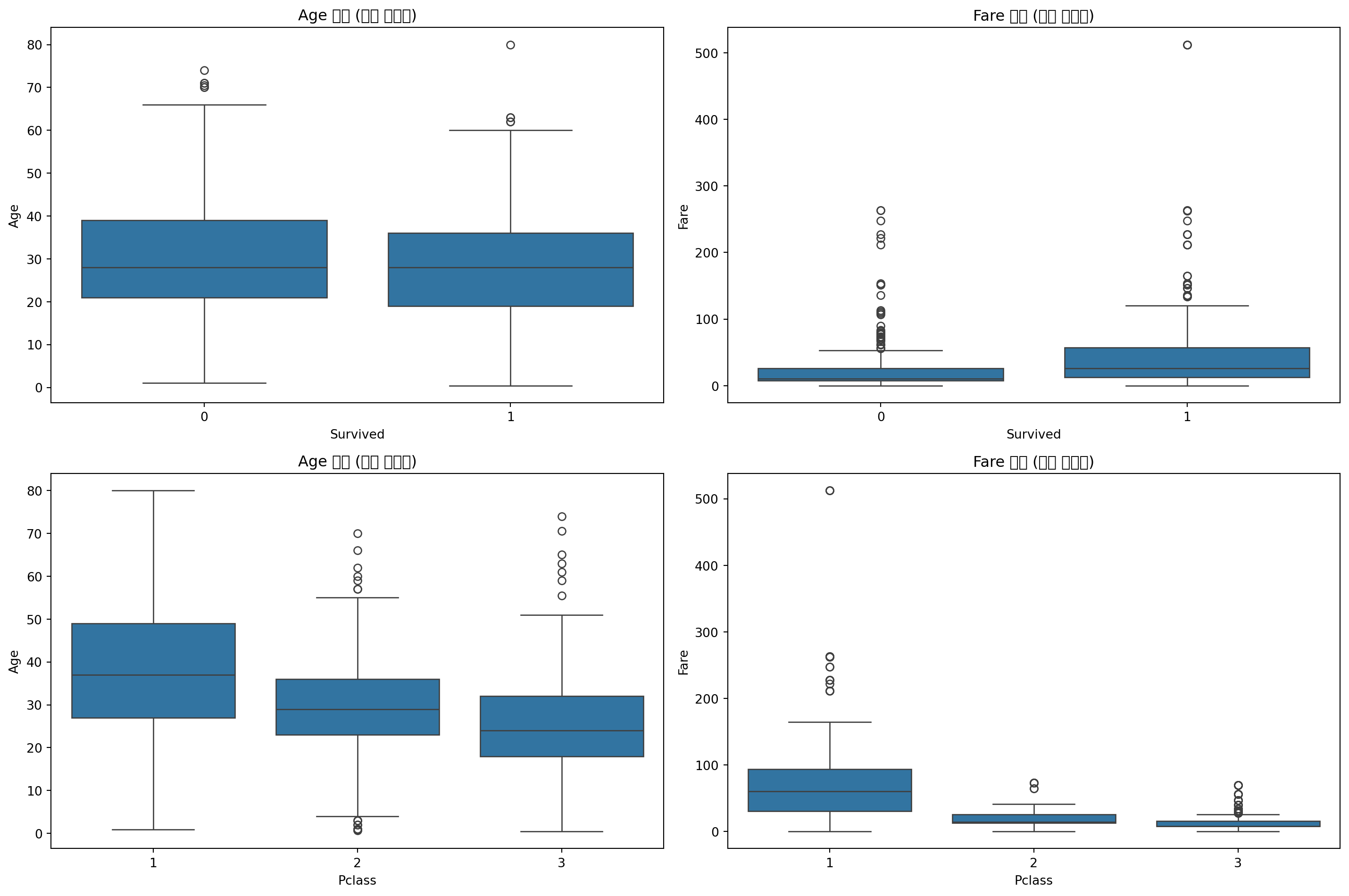
train_x = train.drop('Survived', axis=1).values
train_y = train['Survived'].values
test_x = test.values